Data visualisation can be a powerful approach to analyse and discover new insights from its data simply by looking at it. We used data from BlaBlaCar obtained through their API in order to illustrate how data visualisation can drastically change the way to discover a dataset.
Using NUTS data from Eurostat we can plot European map and display BlaBlaCar travels for a given month. Note that the BlaBlaCar api uses EPSG-4326 coordinate reference system. We used geopandas library to handle the file downloaded from Eurostat.
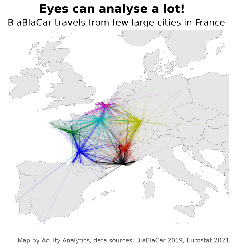
After a few formatting steps we obtain the following chart:
In just a look, you are able to identify outliers, as well as to understand some of the information contains into the dataset, such as long distance main destination (Germany, Belgium, Spain...) or clusters of travels (Marseille to Bordeaux, Marseille to Toulouse...).
This chart can be easily completed, or filtered, with additional information contained in the BlaBlaCar dataset, such as the price, or the brand of the car used for the travel.
Acuity Analytics
At Acuity Analytics, we understand that every data-informed decision process development is an exploration rather than a dogmatic assertion.
Join us in our pragmatic approach to data analysis, where we humbly aspire to make meaningful contributions to your applications.
Contact
contact@acuity-analytics.eu
Acuity Analytics
SASU au capital de 1000 euros 987 753 142 R.C.S Paris